
How to read candlestick charts: a plain guide
By Bec, futures trader and founder of Wildflower · Updated
Each candle shows four prices from one stretch of time: where price opened, the highest it went, the lowest it went, and where it closed. The thick body runs between the open and the close, and the thin wicks reach up to the high and down to the low. A green candle closed higher than it opened. A red candle closed lower.
What a candlestick shows
A One bar on a price chart. It shows where price opened and closed, and the highest and lowest it reached, in one stretch of time.More in the glossary is one bar on a price chart. It sums up everything price did in one stretch of time, such as one minute, one hour or one day. It does that with four prices, often written Open, high, low and close: the four prices a candle or bar shows for its stretch of time.More in the glossary:
- Open: the first price traded in that time.
- High: the highest price traded.
- Low: the lowest price traded.
- Close: the last price traded before the time ran out.
The thick part is the The thick part of a candle, between its open and its close.More in the glossary. It runs between the open and the close. The thin lines above and below are the The thin lines above and below a candle’s body. Their tips are the highest and lowest prices in that candle.More in the glossary, also called shadows. Their tips are the high and the low. The name comes from the shape: a body with a wick at each end, like a candle.
How to read a candle, step by step
1. Check the colour
Green means it closed higher than it opened. Red means it closed lower.
2. Read the body
On a green candle, the open is the bottom of the body and the close is the top. On a red candle, it’s the other way round.
3. Read the wicks
The tip of the top wick is the high. The tip of the bottom wick is the low.
4. Measure the range
The distance from high to low is the candle’s range: how far price travelled in that time.
A candle doesn’t show the order things happened in. A green candle with long wicks could have hit its high first or its low first. Only a smaller timeframe, or the individual trades, can tell you that.
Green and red candles
Green candles closed higher than they opened. Traders call them Rising, or expecting a rise. A bullish candle closed higher than it opened.More in the glossary or up candles.
Red candles closed lower than they opened. Traders call them Falling, or expecting a fall. A bearish candle closed lower than it opened.More in the glossary or down candles.
Colours are only a setting. Some charts use white and black, or hollow and filled bodies. On some platforms, a hollow candle compares its close with the candle before it, not with its own open. If a chart looks odd, check its settings.
What different candle shapes record
Long body, short wicks. Price opened near one end of its range and closed near the other. Traders call it a full-body or wide range candle.
Small body, long wicks. Price went both ways but closed near where it opened. When the open and close are at or very near the same price, it’s called a doji.
Long lower wick. Price traded well below the body, then came back up. Depending on where it appears, traders call it a hammer or a hanging man. Read about pin bars and hammers.
Long upper wick. Price traded well above the body, then fell back. Traders call it a shooting star or an inverted hammer, depending on where it appears.
A shape records what already happened. A pattern name doesn’t decide what price does next.
Reading several candles together
One candle is a small piece of the story. Traders read a run of candles by comparing each one with the ones before. When each high and each low is above the last, traders call it an uptrend. When both keep falling, a downtrend. When they go sideways, a range. Read about higher highs and higher lows.
How timeframes change the candles
The timeframe is how much time each candle covers. The same prices look different on different timeframes. Three 5-minute candles make one 15-minute candle. Its open is the first candle’s open, its close is the last candle’s close, and its high and low are the highest high and the lowest low of the three.
Here, the 5-minute chart shows a rise and then a fall. The 15-minute candle shows only a small red body with long wicks. Neither is wrong. They’re the same trading, summed up in different sized pieces. Read about timeframes.
Your candles can also differ from someone else’s. Charts can start the day at different times, use different time zones, or come from different price feeds.
Where candlestick charts come from
Candlestick charts began in Japan, where rice traders recorded prices this way in the 1700s. A rice merchant called Munehisa Homma is often credited with early work on them. Steve Nison brought them to Western traders in his 1991 book, Japanese Candlestick Charting Techniques. Many of the pattern names, like doji, come from that tradition.
Often confused with
Bar chart (OHLC bars). The same four prices, drawn as a vertical line with a tick on the left for the open and a tick on the right for the close.
Line chart. Joins up the closes only. It hides the open, high and low.
Heikin Ashi. Candles worked out from averages of the price, not the real open and close. They look smoother, but a Heikin Ashi candle’s open and close aren’t the real first and last prices traded.
Renko and range bars. New bars form when price moves a set distance, not when time passes, so each bar can cover a different amount of time.
Candlestick indicator for TradingView
Have every candle shape marked for you, to your own rules
Spotting shapes by eye across hundreds of candles is slow, and it’s easy to miss one. Instead, tell Wildflower’s Indicator the shape you want in plain words, like “mark every engulfing candle”. No coding needed. It marks every one on a chart so you can check it matches your rules. Then it gives you a script to add to TradingView, with a step-by-step guide.
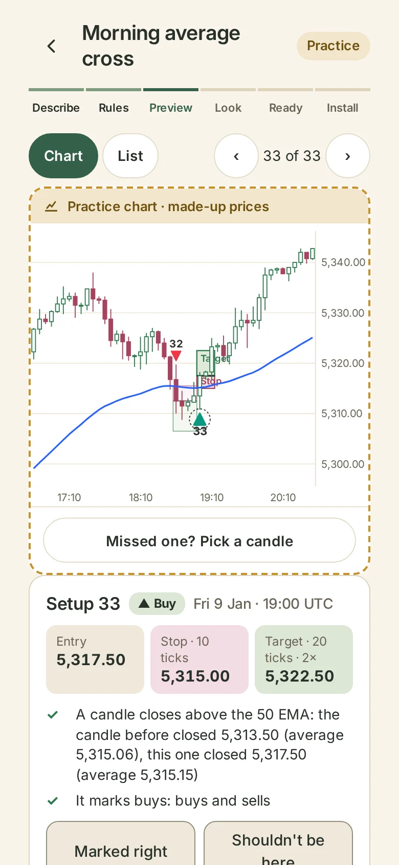
Try it free. You only pay when you add it to TradingView.
Common questions
What are the four prices in a candlestick?
The open, high, low and close, often written OHLC. More above.
What do green and red candles mean?
A green candle closed higher than it opened. A red candle closed lower. The colours are a chart setting, so some charts use others.
What is the body of a candle?
The thick part, between the open and the close.
What does a long wick mean?
Price traded that far, then came back before the candle closed. It records what happened. It doesn’t tell you what happens next.
What is a doji?
A candle whose open and close are at or very near the same price, so its body is tiny.
Where is the open on a red candle?
At the top of the body. The close is at the bottom.
Which timeframe is best for candlestick charts?
There’s no best one. Each timeframe shows the same trading in different sized pieces. The one you watch is your choice.
Do candlestick patterns predict price?
No pattern decides what price does next. A pattern name describes a shape that already formed.
What’s the difference between a candlestick chart and a bar chart?
Both show the open, high, low and close. A candlestick fills in the body between the open and close. A bar uses small ticks instead.
Why don’t my candles match someone else’s?
Charts can start the day at different times, use different time zones, or use different price feeds, so their candles can differ.